


Steve loves motorbikes
He fell in love as a toddler. Steve would eagerly await his father rumbling up the driveway on his noisy bike as he returned home from work.
After purchasing his first bike when he was 17 he was off. He loved the freedom it represented. The ability to ‘throw a leg over’, squeeze the throttle and take off with the wind on his face forgetting about all the worries of the day.
Steve owned many bikes over the years and his love evolved into the classic ‘cafe racer’ style. This style of bike represents a time in the 1960s when riders were stripping back bikes to get the weight down which improved performance and handling. This was so they could race from café to café which meant lots of speed and the ability to pass ‘the ton’ or 100 mph.
The cafe racers evolved into a design sub-culture where all the accessories were removed and the motorbikes look naked, grabbing your attention immediately. The philosophy is about taking the bike back to the essence of the only things you need to ride the motorcycle.
Their design is timeless.
For Steve, it is more than just riding a motorbike, it is a total sensory experience. The look, the feel, the rawness of the machine. The emotions it conjures.
Less is certainly more.
Hit it with the simple stick
The late, great Steve Jobs when talking about Apple’s approach to design once said:
“That’s been one of my mantras – focus and simplicity. Simple can be harder than complex: You have to work hard to get your thinking clean to make it simple. But it’s worth it in the end because once you get there, you can move mountains.”
A better product exists when there is nothing more to take away. This has never been truer than when approaching website design.
The current problem is that websites tend to get overloaded with information. It is very easy to have all the bells and whistles and to clutter the layout. Instead, when the site is being designed, always ask yourself “what can I remove?” Focus on the one purpose for your site or page. The perfect form will be achieved when only the necessary elements are used and the superfluous is eliminated.
Human beings are visual thinkers. Not data crunchers. To effectively communicate an idea or a message the best way is to visually represent it.
Every person has a different take on what constitutes good design. Websites are a visual medium so the design of the site’s layout and elements play a huge role in its success. Design conveys an emotional response before people read the content of the website. To the human brain, emotions are so important as this is how we not only interpret but remember things and form memories.[1]
Who cares what the site looks like I hear you saying? Companies and products that have a heightened sensitivity to design consistently perform better.
It attracts patrons and keeps them coming back. The success of companies like Apple demonstrate the power of building beautiful looking, functional products (which are sold at a premium in the market place). Who wouldn’t like to charge more for their products and services?
Design is a crucial tool to differentiate your business, stroking consumer lust and demanding higher prices as a result. The simple fact is that high-quality design is good for business and a real advantage. A website that uses good design principles will be more successful. It will elicit better responses from prospects and conversion rates will be higher. Better still, it wards off commoditisation, meaning that your business doesn’t need to compete on price and features alone. The end result is that good design will help you generate more revenue and profit.
More often than not a website is a person’s first interaction with a business. From that very first encounter of going to Google, typing in a search phrase and clicking on your website you are on display. People form an opinion on the signals that a website conveys. The design of your site provokes an emotional response. It stirs a customer’s desire. The impact you make better be good otherwise you may have blown your chance.
It takes just a twentieth of a second for a user to get a first impression regarding your website, according to Canadian researchers published in the journal Behaviour and Information Technology.[2]
As Steve Jobs stated, “The ultimate goal is to truly understanding their needs better than anybody else.” Even before they actually need what we have to sell. Making a great impression will give you a better chance of the searcher picking up the phone or requesting more information so that you capture the lead or enquiry and not your competitor. In the long run good design keeps the visitor engaged and makes for happier customers.
[1] Some characteristics of people’s traumatic memories.
Christianson, Sven-Åke; Loftus, Elizabeth F.
Bulletin of the Psychonomic Society, Vol 28(3), May 1990, 195-198.
[2] Lindgaard G., Fernandes G. J., Dudek C. & Brown J. Behav. Inf. Technol., 25. 115 – 126 (2006).
Design is not just about the look and feel of the website, rather the way it makes you feel and think. This needs to be balanced against usability of the website. After all the end user is in 100% control of their mouse and if they can’t find what they need, they will leave.
9 characteristics of good design include:
A conversion is when someone picks up the phone, fills out a form or makes a purchase from your website. It is far easier to double conversions (phone calls / opt-ins / email enquiries) on your website than it is to double your traffic (the number of people visiting your website).
The ultimate purpose of a website is to display information and elicit a response. If someone doesn’t find what they are looking for within a narrow window of time, they leave. By focusing on what is important to the prospect by making their way through the website as pain free as possible you will have a dramatic impact on conversions. Stay focused on the end user and why they are using your website. Simple examples are things like the placement of a phone number at the top of every page or the location of a search bar. With so much competition and so many websites to choose from we are seeing less tolerant and more distracted users.
Having the end user in mind
Be very clear about who the end user is. What are their goals when arriving at your website? Understanding their characteristics, behaviours and habits will ensure the new design is consistent with what they want to achieve.
 Oi, take note! – Ensure your website is structured in a logical, easy to use manner. The average user will fumble around for no longer than 10 seconds before getting completely frustrated and moving on.
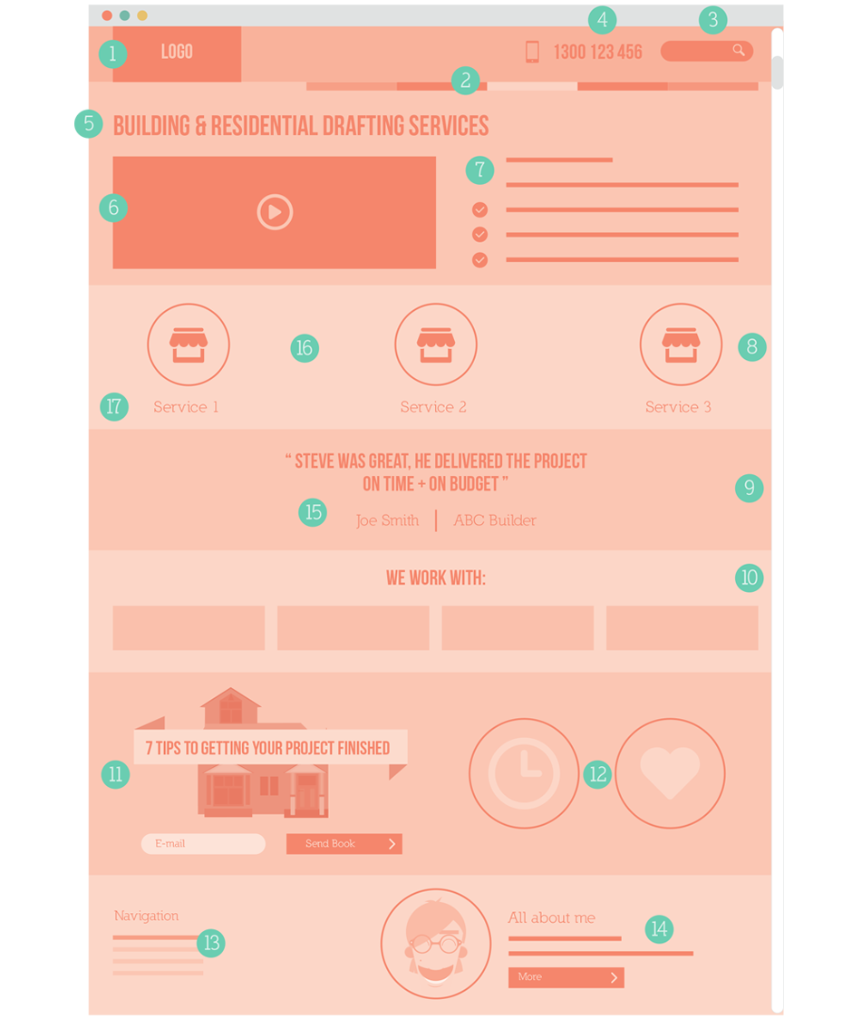
Humans are creatures of habit. The most accepted convention and what users have grown to expect is to have your logo in the top left hand corner. When clicked it links back to the homepage. Don’t make your logo too large. It’s not the size that counts!
Navigation should be located to the top right or just below the logo. Don’t forget to highlight the page that you are currently on, for example if you are on the ‘about us’ page then this link should be a different colour in the navigation. The navigation should be clear and intuitive with pages names as short as possible; ‘about’ will suffice instead of ‘about us’.
If someone can’t find what they need they will typically search. This search bar should be clearly visible located at the top right of the page. The button next to the search field should say ‘search’. Studies have indicated that the ideal search bar width is 27 characters wide.[1]
Having your phone number at the top of every page makes it easy for someone to pick up the phone and talk to a human being. On the mobile version of your site it should dial the phone number.
When someone lands on your website, they should understand who you are and what you do at a glance. A strong headline on the homepage is critical to validating that the user is in the right place. There should be no doubt in the mind of the prospect as to what problem you solve in the marketplace.
Video is such a powerful way to build trust. Prospects can look down the lens and immediately form judgements on your business’s products and staff. They can see whether you are a person they would like to do business with. It is a great way to build rapport and leverage your sales staff many times over (without them having to give the same sales presentation over and over again). It allows for a more intimate connection and adds another touch point to the potential sale.
Instead of focusing on the features of your product, focus on the benefits. Focus on what’s in it for the prospect and the larger problem that they are facing, for example confusion, lack of time. The goal here is to get them emotionally engaged in the product.
What do you think is more interesting to read? A website that uses line after line and paragraph after paragraph of text? Or a website that puts thought into understanding the most important elements of text and visually representing these in icons, infographics or diagrams?
There has been a strong growth in diagrams called infographics. This is a way of arranging and sorting data and then presenting it visually in a simplified manner. A data heavy, complex topic lends itself very well to this approach as infographics change the way a story is presented. It simplifies and breaks the data down into digestible, visual chunks. A beautiful looking infographic can make a dry subject interesting and digestible.
Testimonials (ideally in video format) of other real customers using your products and services are the social proof that prospective customers will be looking for. This breeds confidence by seeing that other real people are happy with your products.
Using logos on the homepage of your website is a great way of building trust and removing any doubt in the visitor’s mind. Examples of logos you can use are:
The whole purpose of your website is to capture prospects’ contact details. At a minimum, capture the following information:
Keep forms simple and the number of fields at a minimum. Users fill out forms from top to bottom. Form labels should be placed above the form field. Highlight the active form field and ensure mandatory fields are marked accordingly.
Survey your customers for their pre-purchase concerns and then formulate guarantees which pre-empt these concerns. Ideas include:
Any viewer that makes it to the bottom of your page is going to see it (users do scroll). It makes sense to have a repeat of your primary navigation as the viewer has finished with that page and will be looking for the next one. If there is space, include contact details and a phone number.
People buy from people. If you can paint a picture of the team and the people who are likely to answer the phone and work on your project or fulfil the order proves you are a real organisation made up of human beings, just like the customer.
When something is effortless to read you will naturally read more of it. Good content layout effectively uses headlines, bullet points, ordered lists, tables and shorter paragraphs. Research has proven that left aligned text is more readable than justified text (aligned both left and right). Font size is also an important factor. A minimum of 13pt should be used for optimum readability on screen with a good line height of around 1.5. Ensure there is good contrast between the font and the background colour. Sans serif fonts (Helvetica, Arial, Tahoma) are easier to read online than serif fonts (Times New Roman, Georgia).
Empty space on a page is called ‘white space’. Some people think that white space is wasted space. This is not the case. White space increases readability and therefore conversions which is especially important on a content driven website such as a blog. It gives your content space to breathe and makes it more digestible.
Research indicates that the colour blue is still the best indicator of a link within your website. There are no problems deviating from this but ensure there is ample contrast from other text colours within our site. Also include a colour change for the mouse hover state.
This was taken from the tale of Hansel and Gretel who laid down a trail of breadcrumbs to find their way back home. This navigational tool is more relevant on internal pages and gives the user a visual representation of which page they are on and where they have come from.
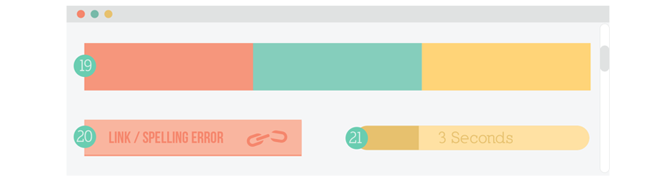
Use no more than three primary colours in your website. The goal of colour is to complement, contrast and provide vibrancy. It talks to the user on an emotional level and will evoke different moods and responses. There are entire volumes written around colour theory. As a general rule of thumb, use complementary colours based on a primary colour (around 60% usage), a complementary colour (around 30% usage) and an accent colour (around 10% usage).
Great, error-free copy is a must. If errors exist people will assume they exist in your products and services also. Broken links within a site are a turn off.
Users are impatient and a slow loading website will have the user hitting the back button very quickly. You have approximately three seconds before their flow is interrupted and the end user loses interest (refer to Chapter 7).
[1] https://www.nngroup.com/books/prioritizing-web-usability/
Attention span on the web
The visitor to your website has the ultimate say. They are the ones in control of the mouse. If they don’t like what they see or can’t find what they need then they move on. The user gets to decide everything.
With so much choice your competitors are only a click away. Customers are overwhelmed with options and have zero tolerance for websites that are poorly laid out and confusing.
You never get a second chance to make a good first impression. Which is why not only the design but the usability of the site needs to be great. If it’s not, you have blown it.
Invest in quality design because it will yield dividends in the future. Balance the design against good usability, enabling the prospect to find what they need and get in touch.
But it isn’t all about good looks. Next up, Chapter 5 focuses on what will lead people to your doorstep – content. And we need plenty of it.