Design is not just about the look and feel of the website, rather the way it makes you feel and think. But if your homepage doesn’t convert, what is the point?
So a balance needs to be struck between aesthetics and usability of the website. After all the end user is in 100% control of their mouse and if they can’t find what they need, they will leave.
Here are some tips (21 in fact) that we have learn’t after 9 years of building websites.
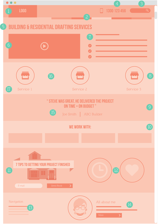
1. Logo should link back to the homepage
Humans are creatures of habit. The most accepted convention and what users have grown to expect is to have your logo in the top left hand corner. When clicked it links back to the homepage. Don’t make your logo too large. It’s not the size that counts!
2. Navigation should be on the top right or below the logo
Navigation should be located to the top right or just below the logo. Don’t forget to highlight the page that you are currently on, for example if you are on the ‘about us’ page then this link should be a different colour in the navigation. The navigation should be clear and intuitive with pages names as short as possible; ‘about’ will suffice instead of ‘about us’.
3. Include a site search
If someone can’t find what they need they will typically search. This search bar should be clearly visible located at the top right of the page. The button next to the search field should say ‘search’. Studies have indicated that the ideal search bar width is 27 characters wide.[1]
4. Contact details at the top of every page
Having your phone number at the top of every page makes it easy for someone to pick up the phone and talk to a human being. On the mobile version of your site it should dial the phone number.
5. Be really clear on what you do in the headline
When someone lands on your website, they should understand who you are and what you do at a glance. A strong headline on the homepage is critical to validating that the user is in the right place. There should be no doubt in the mind of the prospect as to what problem you solve in the marketplace.
6. Use a sales video/documentary video
Video is such a powerful way to build trust. Prospects can look down the lens and immediately form judgements on your business’s products and staff. They can see whether you are a person they would like to do business with. It is a great way to build rapport and leverage your sales staff many times over (without them having to give the same sales presentation over and over again). It allows for a more intimate connection and adds another touch point to the potential sale.
7. Use benefit-ridden copy
Instead of focusing on the features of your product, focus on the benefits. Focus on what’s in it for the prospect and the larger problem that they are facing, for example confusion, lack of time. The goal here is to get them emotionally engaged in the product.
8. Make your content interesting
What do you think is more interesting to read? A website that uses line after line and paragraph after paragraph of text? Or a website that puts thought into understanding the most important elements of text and visually representing these in icons, infographics or diagrams?
There has been a strong growth in diagrams called infographics. This is a way of arranging and sorting data and then presenting it visually in a simplified manner. A data heavy, complex topic lends itself very well to this approach as infographics change the way a story is presented. It simplifies and breaks the data down into digestible, visual chunks. A beautiful looking infographic can make a dry subject interesting and digestible.
9. Use testimonials
Testimonials (ideally in video format) of other real customers using your products and services are the social proof that prospective customers will be looking for. This breeds confidence by seeing that other real people are happy with your products.
10. Communicate proof and build trust through logos
Using logos on the homepage of your website is a great way of building trust and removing any doubt in the visitor’s mind. Examples of logos you can use are:
- the clients you work with
- the partners or brands you stock
- media exposure you have had, for example newspapers or TV programs.
11. Capture their details
The whole purpose of your website is to capture prospects’ contact details. At a minimum, capture the following information:
- Name
- Email address
- Phone
Keep forms simple and the number of fields at a minimum. Users fill out forms from top to bottom. Form labels should be placed above the form field. Highlight the active form field and ensure mandatory fields are marked accordingly.
12. Use guarantees/security seals to remove fear
Survey your customers for their pre-purchase concerns and then formulate guarantees which pre-empt these concerns. Ideas include:
- 30-day product guarantee
- Same day shipping
- Lowest price guaranteed
- Largest range of products
13. Make use of the footer
Any viewer that makes it to the bottom of your page is going to see it (users do scroll). It makes sense to have a repeat of your primary navigation as the viewer has finished with that page and will be looking for the next one. If there is space, include contact details and a phone number.
14. Include team members’ photos and videos
People buy from people. If you can paint a picture of the team and the people who are likely to answer the phone and work on your project or fulfil the order proves you are a real organisation made up of human beings, just like the customer.
15. Typography for readability
When something is effortless to read you will naturally read more of it. Good content layout effectively uses headlines, bullet points, ordered lists, tables and shorter paragraphs. Research has proven that left aligned text is more readable than justified text (aligned both left and right). Font size is also an important factor. A minimum of 13pt should be used for optimum readability on screen with a good line height of around 1.5. Ensure there is good contrast between the font and the background colour. Sans serif fonts (Helvetica, Arial, Tahoma) are easier to read online than serif fonts (Times New Roman, Georgia).
16. Use white space
Empty space on a page is called ‘white space’. Some people think that white space is wasted space. This is not the case. White space increases readability and therefore conversions which is especially important on a content driven website such as a blog. It gives your content space to breathe and makes it more digestible.
17. Link colour
Research indicates that the colour blue is still the best indicator of a link within your website. There are no problems deviating from this but ensure there is ample contrast from other text colours within our site. Also include a colour change for the mouse hover state.
18. Include breadcrumbs
This was taken from the tale of Hansel and Gretel who laid down a trail of breadcrumbs to find their way back home. This navigational tool is more relevant on internal pages and gives the user a visual representation of which page they are on and where they have come from.
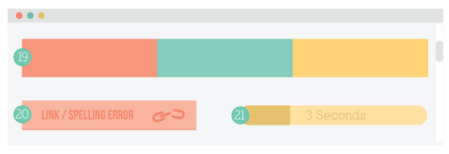
19. Colour palette
Use no more than three primary colours in your website. The goal of colour is to complement, contrast and provide vibrancy. It talks to the user on an emotional level and will evoke different moods and responses. There are entire volumes written around colour theory. As a general rule of thumb, use complementary colours based on a primary colour (around 60% usage), a complementary colour (around 30% usage) and an accent colour (around 10% usage).
20. Language, spelling and errors
Great, error-free copy is a must. If errors exist people will assume they exist in your products and services also. Broken links within a site are a turn off.
21. Load time
Users are impatient and a slow loading website will have the user hitting the back button very quickly. You have approximately three seconds before their flow is interrupted and the end user loses interest (refer to Chapter 7).
Attention span on the web
The visitor to your website has the ultimate say. They are the ones in control of the mouse. If they don’t like what they see or can’t find what they need then they move on. The user gets to decide everything.
With so much choice your competitors are only a click away. Customers are overwhelmed with options and have zero tolerance for websites that are poorly laid out and confusing.
[1] https://www.nngroup.com/books/prioritizing-web-usability/