We are working with the awesome Greater Springfield Chamber of Commerce.
Initially contracted to work on their new website, the focus soon shifted to their existing logo:
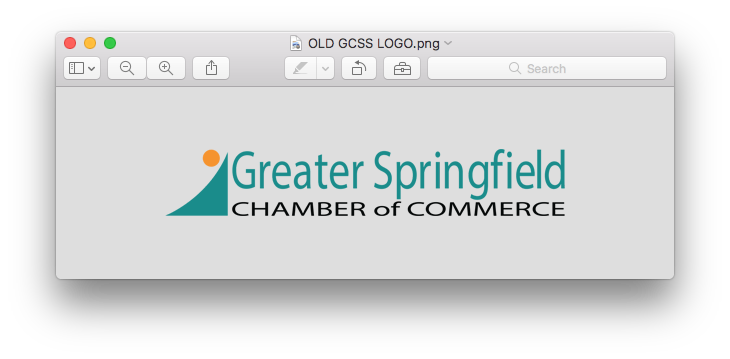
The logo had dated significantly since its inception over 10 years ago.
 Most of the board members voiced their general dissatisfaction with their old logo.
I made the analogy that your brand is like the foundation on a house. It is vital that a house had a rock solid foundation otherwise anything else built on top of it will come crumbling down.
So what does a chamber of commerce actually do?
They provide educational services, provide information and training on business issues, a platform for networking and most importantly communication within the community.
Their motto is:
“We exist for the members, by the members and of the members”
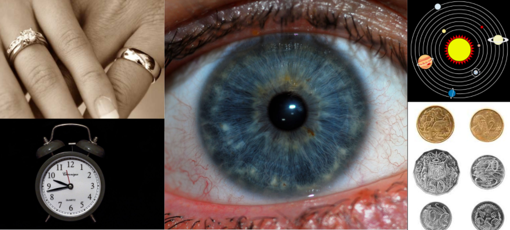
In our initial briefing session with the board themes included unity, connection, marriage, life, wholeness, journey, potential and inclusion.
Visuals that represented the above mentioned themes started to get fleshed out and “visual’s” board was created:
Circles played a very consistent themes in these visuals. Sketches and ideas were put down on paper:
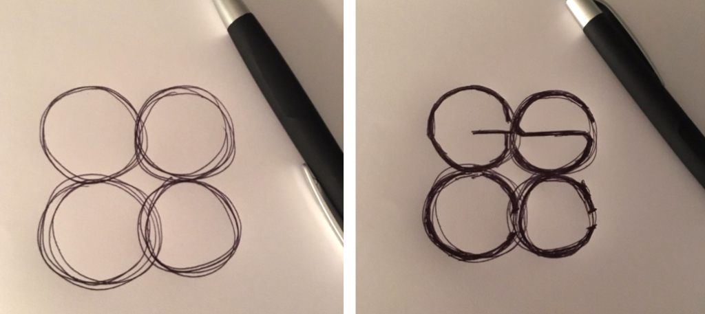
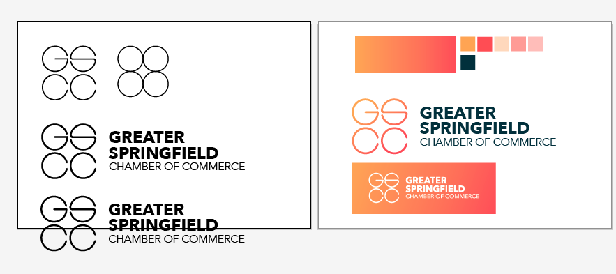
These concepts were then digitised and further explored:
A lot of thought went into the colours. Colour plays a vital role in the messages conveyed by a brand. We wanted to show:
- Nature
- Growth
- Progress
- Wealth
- Renewal
- Health
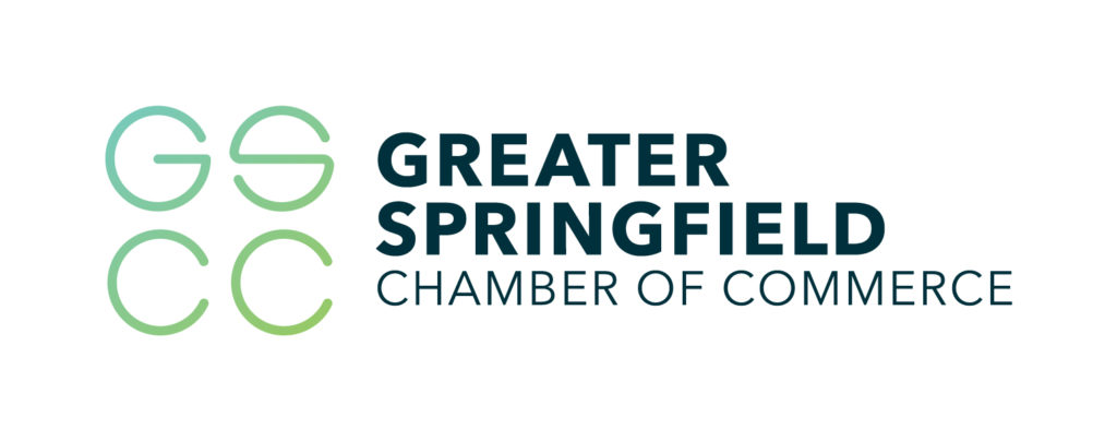
A green / teal colour palette was the logical choice:

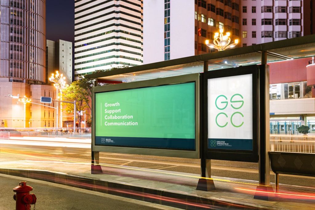
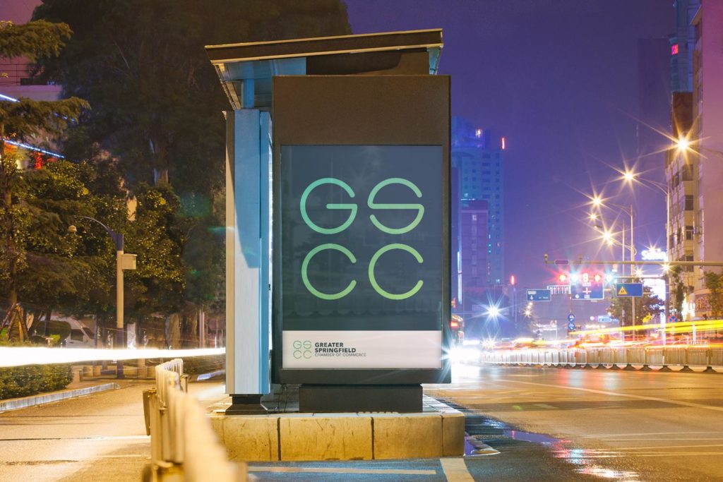
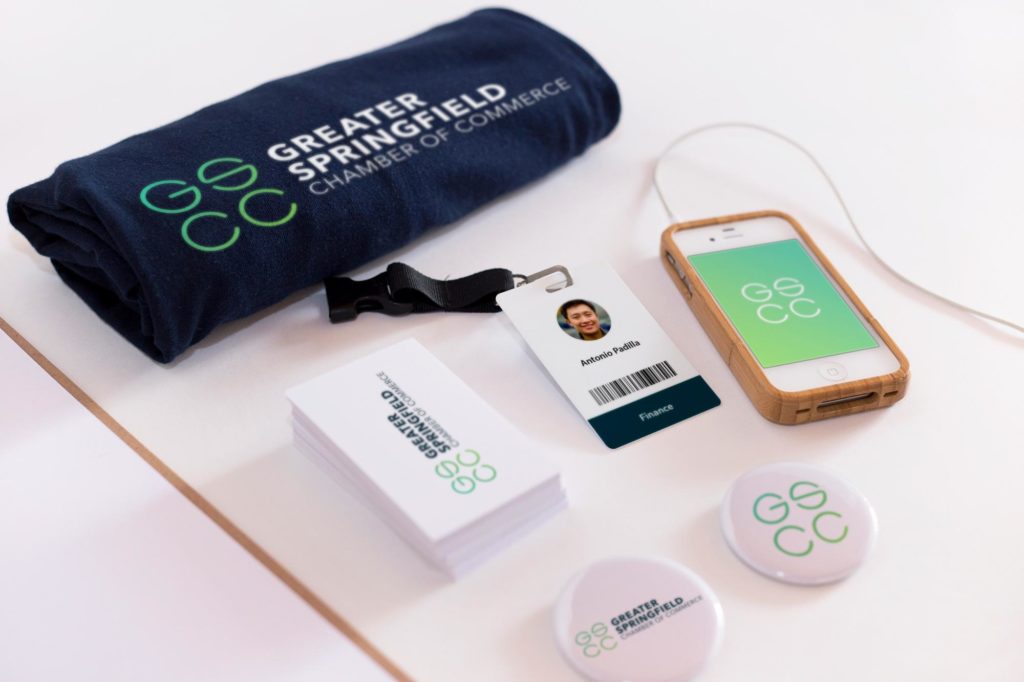
And here is where we ended up. Pretty spiffy if I don’t say so myself.
Work is currently underway on the new site which is nearing completion.

Need help with your brand? Get in touch.